
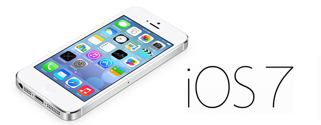
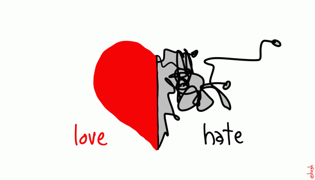
iOS7 has been released upon the world to much praise, and criticism. It’s always amazing to me how much people dislike change, and how they take to the twitterverse to say so. Designers and bloggers alike have been happily pulling apart iOS7, complaining about everything from the fonts to the spacing to the way it looks like Android. They’ve measured spacing between lines down to the very pixel, and then complained bitterly about it if it wasn’t exactly the same as the line above it. As if pixel perfection denotes good design. And that’s the point about the new OS interface, its tried to do away with design.
I feel like most of these naysayers have missed the purpose of the new flatter simpler interface. One simply needs to read Jonny Ive’s rationale for the new design to understand why he did what he did.
“We understood that people had already become comfortable with touching glass … So there was an incredible liberty in not having to reference the physical world so literally.” He adds, “We were trying to create an environment that was less specific. It got design out of the way.”
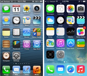
Ive is referring to iOS 7’s more simplified and almost two-dimensional feel, particularly when it comes to app tiles. The so-called skeuomorphic template established during Jobs’ time was laid to rest in favor of a less fussy look. Skeuomorphic template? That’s where real textures and objects are mimicked, such as the leather bindings of the Calendar app or the yellow post-it notes icon, giving real world feel to a digital approximation.

Of course, it makes sense. When people first started using touch screen smartphones they had to learn what to touch and what not to touch, so inputs or commands like ‘submit’ and ‘delete’ had glossy background images that looked like green and red buttons. But now if you see the words ‘submit’ or ‘delete’ on a screen do you really need to be told it’s a button and that you can tap on it?
No, not really, we’ve all learnt to touch our screens, we’ve had 6 years to learn how iOS and other touch screen interfaces work.
Why should a digital button look like a real world one? Another prime example of this is the classic spirit level app. I love the way apple rethought the design on this one. It’s striking and brilliant and nothing like a real spirit level. (To find the spirit level on your phone, open the compass app and swipe to the next screen)
In my opinion the new look iOS will free up designers to think of better more innovative ways to utilize the screen space when developing apps for iOS7. Now that we’re no longer constrained to using real world elements like buttons and textures, now that the OS itself is simpler and less intrusive, it’s like starting with a clean slate. I expect to see really amazing designs coming out of app developers for iOS7 in the next few months.
If nothing else iOS7 has shown us how stale iOS6’s design was. How can that not be a good thing?
